
Visualization of Online Datasets
- DOI
- 10.2991/ijndc.2018.6.1.2How to use a DOI?
- Keywords
- Online datasets; Visualization; Browser Extensions; Data transformation; HTML
- Abstract
As computing technology advances, computers are being used to orchestrate and advance wide spectrums of commercial and personal life, information visualization becomes even more significant as we immerse ourselves into the era of big data, leading to an economy heavily reliant on data mining and precise, meaningful visualizations. However, accuracy of information visualization techniques is heavily dependent on the knowledge and capabilities of users, leaving novices in many fields at a disadvantage. This is a challenging problem that has been inadequately addressed regardless of the influx in visualization tools. Therefore, this paper proposes a novel approach with a focus on online datasets, allowing users to automatically and accurately visualize datasets. Experiment results show that using a browser extension and specially created HTML tables containing custom attributes - stating the data attribute type - the approach is able to detect and present the most suitable visualizations at the click of a mouse. This proposed approach provides a means for novices to quickly and accurately visualize online datasets.
- Copyright
- Copyright © 2018, the Authors. Published by Atlantis Press.
- Open Access
- This is an open access article under the CC BY-NC license (http://creativecommons.org/licences/by-nc/4.0/).
1. Introduction
As big data continues to dominate large aspects of business and domestic life - growing exponentially, information visualization has also seen significant growth figures in terms of use in research, development and all fields of life, resulting in a rise in numbers of visualization tools. As the volume of data generated by organizations continues to grow, greater numbers of people in all manner of fields are making use of what visualization offers, from senior management presenting data in an attempt to persuade an audience or academics seeking to uncover hidden information within a dataset, to domain experts exploring the depths of a dataset. This far-reaching desire to effectively visualize data has led to a significant increase in the number of visualization tools available, offering a diverse array of functionality to users on various differing platforms. Nevertheless, such progression has opened the door to a new problem – how can a visualization tool successfully perform for users that are new or uniformed in the field of visualization. Highlighted by the fact that novices will generally misunderstand encodings, ignore all but the most basic functionalities and produce visualizations incapable of answering their desired questions. To prevent future novice users from these pitfalls, a tool should be created that will be able to dynamically create accurate, informative visualizations based on the attribute types encountered. Additionally, research has shown an absence in the understanding and awareness to the benefits that visualization brings, leading to a perceived indifference to the field of visualization amongst certain factions. With such a tool, it brings optimism that a larger demographic could be obtained, further advancing the field of visualization.
The work undertaken focused upon datasets found online, with the aim of determining whether a browser extension could be implemented to allow users to dynamically and effectively visualize their chosen online dataset. In doing so, maximization of efficiency would provide mutual benefit for both the website proprietor and users, allowing for effortless, fast analysis of data in greater detail.
Test results show that the approach is capable of accurately obtaining and transforming the data into visualizations, by the use of a browser extension, nevertheless it is hindered in the detection of data attribute types, required to dynamically provide the optimum visualization method. Proposed by this paper is the creation of a new HTML attribute for tables that will enable for the dynamic detection of the corresponding data attribute types. The extension will use the stated data attribute to dynamically provide the suitable visualization for users.
The remainder of this paper will be structured as follows. Section 2 examines related works. The main approach, including components in the design and implementation stages are covered in section 3. Section 4 gives a detailed example to demonstrate the success of the proposed approach. Testing and evaluation are provided in section 5. Finally, section 6 concludes the paper and offers an outlook towards future works.
2. Related Works
Grammel et al [1] carried out revealing research into the attempts and failings of visualization novices to construct meaningful findings. Via participant observation, the research found that the main obstacles faced by novices were transforming their questions into the necessary data attributes, design of visual mappings and then understanding of the visualizations created. Additionally, novices will simply stick to using simple visualization they already know such as pie, bar and line charts. They outline in their findings the requirement for the creation of a tool that may suggest visualizations to users and aid in understanding, including the barriers that are challenging for information novices: translating questions into data attributes, constructing visualizations and interpreting the visualizations. All these three aspects will be tackled in this research.
Ali et al [2] conducted thorough research and reviews of visualization tools. However, it must be acknowledged it was conducted with Big Data, unstructured data as the focus, whereas, the focus of this paper is concerned with structured data. Findings still highlight relevant details, they propose that current tools such as Tableau, Plotly and Excel 2016 functionally work well, providing rich visualizations, although programming is required in some instances. Nevertheless, they suggest that one must identify their needs and tool strengths before beginning and that price dictates to most single users/small businesses, accentuating the unsuitable nature of visualization tools for the beginner.
A different method to negating visualization issues of novice users is proposed by Koh et al [3] through an approach focused upon user-centered design. Acknowledging the problems caused by a lack of understanding, they altered the approach to include prototyping at the earliest stages in designing a tool for the healthcare sector. Findings show that in doing so, they could better educate the users on the capabilities of the tool and information visualization techniques. The drawback with such a method is that it cannot be transferred to work as a general concept. To tackle the problems that exist for novices on a grand scale, it must effectively solve the issue and educate independently, after the creation.
Web based visualization tools cover a wide area of interests, large quantities of tools exist from web portals [4] whereby, Becirspahic & Karabegovic use a web portal to gather data from online sources to form a tool allowing users to interact and visualize spatial data. Others are concerned with tracking and visualising user actions online, such as DemographicVis [5] which visualizes people’s demographics based on their actions.
Nevertheless, these tools do not function with the users’ own dataset. A vast array of tools exist online that allow users to upload CSV files, and create visualization from there [6][7][8][9]. However, these tools do not address the problems faced for novices such as which visualization techniques are suitable or educate them in understanding. Additionally, if working from an online source, novices would have to manually transform the data to a CSV file or use additional tools for data scrapping.
3. Approach
This section describes the proposed approach, covering design and implementation, which allows users to dynamically create visualizations for online datasets.
3.1. Methodology
The tool was implemented using evolutionary prototyping which was broken down into three stages or ‘evolutions’, in which a version of the tool was produced and tested by visualization novice users by the means of focus groups, providing feedback, meaning the tool was then refined. The adoption of such an approach prevented any assumptions about novice knowledge and understanding, meaning a tool for novices could be developed by novices, tailored to their wants and needs.
At the end of each evolution of the development, a focus group of both novices and intermediaries was formed to provide the necessary feedback. This feedback, particularly focused on usability and functionality meant that improvement could be made before additional functionality was added.
3.2. Functions
The design and implementation of this system is defined by its requirements. The functional requirements of the system are that it will be able to detect HTML tables, provide a means for users to select and then dynamically handle and transform the dataset before creation of an accurate visualization for the user. Functions implemented are:
- •
Identification and selection of HTML tables.
- •
Transferring and formatting dataset. – the dataset must conform with the C3.js array.
- •
Filtering blank rows. – removing null tuples from the dataset.
- •
User dataset filtering. – allow the user to refine the dataset in accordance to their interest.
- •
User chart selection – Allow the user to try different charting options for their visualization.
- •
Chart Generation.
- •
Chart interactions – Allows for greater exploration and understanding of the dataset.
- •
Exportation – Via .CSV for the dataset or PDF for the visualization produced.
3.3. Architecture
Although browser extensions are built using the same technologies as websites, the architecture of an extension is different. This architecture is made up of a series of files that are held within one main folder which is then compressed with a special .crx suffix.
Several choices need to be made when it comes to the architecture of the extension. Firstly, it is that of the background page. In this instance, the tool is required to have a continuously running script, opposed to one that only runs when an event occurs, due to the necessity of dynamically locating HTML tables when a webpage is loaded. Therefore, the extension will be built with the use of ‘Background Pages’ opposed to ‘Event Pages’. Although this leads to a knock-on effect in performance, with ‘Event Pages’ possessing the ability to unloaded when not active, freeing up resources such as memory. This tool is being designed primarily for desktop computers and will require little memory, meaning the effects won’t be as costly as if the tool was to be design for some less powerful mobile devices. [10]
Another key consideration for the design is content scripts. This will be constructed via the use of JavaScript and will allow for the extension to interact and manipulate the webpages it encounters through the Document Object Model (DOM).
3.3.1. User interface
The design of this extension will allow it to be effective, while limiting the interference with the interfaces created by their corresponding web-designers. With this in mind, the extension will possess very little in the sense of a User Interface (UI) on the web pages being viewed, the detected tables will become highlighted, presenting to the user that selection is available. When the user clicks on the table a new webpage will be activated presenting the chart and other functionalities. The charts themselves created using C3.js a D3 charting library, recognised for its fast performance, compatibility with Google Chrome and data transformation time [11].
3.3.2. Activity diagram
Fig. 1 displays the functional process to be undertaken by the extension. As it shall be implemented using background pages, the extension will be running continuously if it is enabled. Therefore, the diagram starts at the point of the extension being activated. When this occurs, the tool begins identifying and highlighting HTML tables embedded in the page. When tables are highlighted, it enables an onClick function on the table. Upon the user making a selection, the process of transforming the data begins. If no problems occur in the process the data will be passed along the extension where it will be used for charting. If the transfer is unsuccessful, an error message will be displayed to the user and the process will return to the initial table highlighting stage. If the data has been received by the extension, the user will then be redirected to the new tab, where they can select a chart type. Once chosen the visualization will be generated and displayed to the user, where they can then filter the dataset if desired. At this point the user will also be able to export their chosen data as a .CSV file or a PDF of their visualization created.
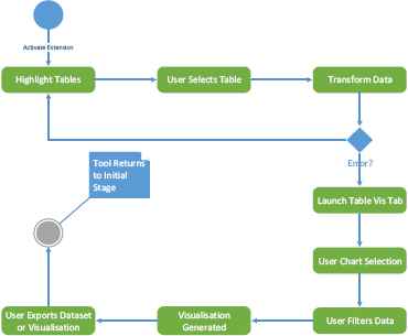
Activity diagram outlining extension process.
3.3.3. Sequence Diagram
The sequence diagram in Fig. 2 outlines how the various components interact with one another while different interactions take place. Going from top to bottom, in the first instance the user selects a table of their choice, this starts a chain of actions, the user clicks on a table. This alerts the extension to open a new Table Vis tab which the data should be passed to through a JSON object. The Table Vis tab waits on the user to select a chart of their choice, once a chart has been chosen, the tab acknowledges this, generates the chart and displays the visualization to the user.
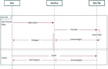
Sequence diagram.
The second interaction shown is for the user selecting to export the visualization. The action is received by the Table Vis tab, processed and sent back to the user in the form of a file.
3.4. Table Detection
For the user to be able to select a table and capture the data inside, the proposed tool must be able to detect the tables on the webpage. Tables are defined in HTML using the standard tag “<table>”. These tags automatically become DOM objects enabling the programmer to access them easily in Javascript and assign functions to the table upon a user action.
For example, the pseudocode below.
Table.on(‘click’, function(){
Variable data = input table data into the data array.
})
The pseudocode specifies that on the left-click of the mouse on a table element, a function is to be triggered that will retrieve the data from the table cells and place them in an array in the variable ‘data’.
The Table Vis Chrome extension requires a specific structure as shown in figure 3. To manipulate web pages for tables and the data embedded inside, a content script is required (content_script.js). This is a JavaScript page that runs in the context of the webpage loaded opposed to in the extension, enabling it to interact and make changes to the DOM. Also required is a background page (background.js) which controls the behaviour of the extension and runs continuously controlling aspects such as the browser action and creation of the Table Vis tab (tab.html) which is controlled by its own JavaScript page (tab.js).
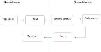
Extension structure.
Once this structure was in place it was required to form a connection between these pages to allow for interaction as the content script and background script are running in different contexts. The solution to this is via the implementation of ‘message passing’ [12]. This sets up a channel on both ends in which they can listen out for events and then send responses. Message passing comes in two different forms; one-time requests which are of course a one-time event and long-lived connections that remain open to conversation. For this tool, both were used, which will be covered at their specific points in this implementation section.
Once the connection is in place, tables can now be accessed and manipulated. Initiating by assigning a long-lived connection listener and a switch statement that allows the extension to toggle on/off. When the extension is in the state of ‘enabled’, an addClass() function and CSS styling is used to highlight tables as the user hovers the mouse pointer over them. Secondly, a function is added to the click event on HTML tables that then uses Table-to-JSON, an open source library that allows for you to pass in data from a table and then transform it into JSON. The JSON object is placed inside of the ‘json’ variable and placed into the long-lived connection channel.
3.5. Producing Charts
Once the data has been collected and stored within a variable, the array of data held within the variable must then be reformatted and transferred to the charting function in order to populate the chart.
The proposed tool achieves this once the data is stored in JSON, it can now be passed from the content script to the background page. An additional long-lived connection is used to trigger a new tab and via the use of a one-time request, ‘chrome.tabs.insertCSS’ and ‘chrome.tabs.executeScript’ the required files were programmatically inject into the new tab.
Transformation of the JSON was then required for compatibility with C3.js. Parameters required to create a chart include, ‘type’ for the type of chart desired and ‘data’ in which it needs data passed into its array called ‘columns’. The JSON object needed restructured to correspond the columns array needed by C3.js.
The pseudocode for data restructuring and chart generation is shown below:
drawChart = function() {
columns = new array
columnTitles = titles from table
forEach (title in columnTitles)
column = get column values table
column.unshift(append the Titles to
front of
column
array)
columns.push(add column to columns
array)
}
chart.load({
columns: load in new array
type: chart type to generate
unload: draw visualization
})
The pseudocode selects the titles from the table, places them first in the array, then adds the rest of the table values. These are then passed into the load function provided by C3.js and the visualization can then be drawn.
3.6. Filtering Blank Data Rows
Blank rows are often used in the styling of HTML tables which can prove troublesome for the extension. If these values were left in the dataset, anomalies in their visualization occur. (see Fig. 4.)
No filtering vs. filtering of rows.
In this example, empty rows were placed at three different sections of the HTML table to mark different sections. However, these rows produced misleading information when the charts are drawn, at points 3, 7, and 23.
A filtering function is designed to remove such blank row. This function loops through all rows in the dataset checking for rows that are made up of entirely of empty rows and removed them before the dataset is processed for charting.
The pseudocode for the filtering is shown below:
filter = function(table) {
forEach (row in table) {
values = get values from object row
values = ignore any repeating
values
if (first and only value = “) {
remove row from table
}
}
return filtered table
}
3.7. Detection of Suitable Charts
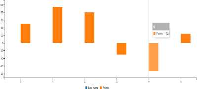
This proved most problematic as there currently exists no fully functional method for detecting the data attribute type. Charting suitability is dependent on examining the data attribute types and using a chart that best represents and reveals the dataset. For example, provided a table such as displayed in Fig. 5.
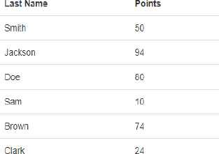
Discrete Categorical Data.
The Data held within is ‘Last Name’ which is categorical given the finite number of categories or possible names, and points are a discrete numerical variable (a count). Such data would therefore be suited to a bar chart as this would denote each name and their corresponding points as stand alone, unconnected values that can be examined. As shown in the Fig. 6.
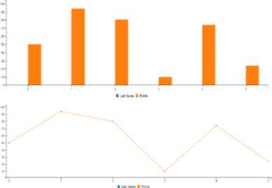
Chart Comparison.
Fig. 6 also provides an example of a line chart being chosen to represent the data. Although the line appears to represent the data adequately, it is incorrect as the line represents a continuation or connection between values that should be discrete.
To provide a means for the proposed tool to identify the attribute types and determine the suitable charting option, some technologies need to be defined first; Custom attributes – Within HTML, tags may have attributes assigned to them. Standard attributes such as id or custom attribute that are created and defined by the user.
For example:
table id=“standard-tag” attributeType=“nonstandard-tag”>
This allows for custom data from HTML-elements to be passed to Javascript.
Case statement – case statements allows a program to perform different predefined actions based on which conditions are met. For the proposed tool, the predefined actions state which chart should be used. The conditions are provided by the custom attributes included in the table tag.
For Example:
switch (new Chart().getattributeType()) {
case discrete & categorical:
if it possesses these values Chart Type
= “Bar Chart”;
break;
case proportional & discrete:
if it possesses these values Chart Type
= “Pie Chart”;
default:
if no data attribute value is defined
Chart Type = “Bar chart”;
}
Bar chart is set as the default charting option, however as outlined later in section I, step 4, the user may choose a charting option from a dropdown menu.
Custom attribute types were placed within purpose made HTML tables to denote the data type held within the table. For example, “discrete” and “categorical” are values provided to a table using this method, upon the user selecting the table, these values are used alongside a case statement asserting which chart type should be used depending on the attributes stated. However, the future of this approach is dependent on such an attribute type being accepted and implemented as a new industry standard for HTML tables
3.8. Charting Options
For the tool proposed to work efficiently, it is imperative that suitable charts for the various data attribute types are implemented. For the prototype four different charting options were selected with a focus not only on variety, however, the charts must be simple to understand for the novice user. The charts will be developed in C3.js, a JavaScript library that uses a mixture of HTML, CSS and SVG to build visualizations.
3.8.1. Bar chart
A very commonly used charting option for the visualization of categorical data. Chosen due to its ability to accurately represent data holding discrete values. This chart is easily recognisable and analyse for the novice, which enhance their confidence and understanding. This C3.js bar chart displays several of the design principles that should be expected from a visualization, its possesses color encodings which include a change of color on hover over – as seen on attribute L- an interaction technique that will hand more control to the users.
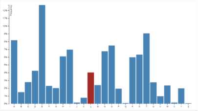
Bar Chart.
For example, shown in Fig, 8, is a categorical online dataset. Highlighted in red upon the user hover.
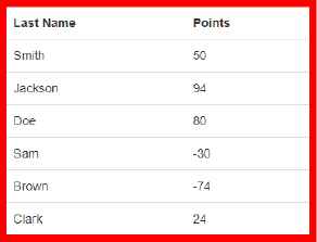
Positive & Negative Discrete Categorical Dataset.
The online table is coded with the custom attributes “categorical” and “discrete”. These values correspond with the attributes suited to a bar chart, which when present, the extension can identify and generate the chart as a bar chart shown in Fig. 9.
Bar Chart Displaying Positive & Negative Values.
Through using the custom attributes, the proposed tool can automatically generate the most suitable chart. Furthermore, the tool is able to handle positive and negative values, while the visual encodings on hover shown in Fig. 9 allow for the user to effectively explore their dataset.
3.8.2. Line chart
In Fig. 10, is the design for a line chart. Similar to that of the bar chart, however, allows for the support of continuous values, displayed by a collection of data points, or ‘markers’. This again benefits from clear labelling, while the squared background allows for increased legibility.
Line Chart.
For example, Fig. 11 displays an online dataset consisting of continuous categorical data. This highlighted table contains the custom attribute values “continuous” and “categorical”, advising the proposed tool that a line chart should be used.
Continuous Categorical Dataset.
Upon selection, the proposed tool automatically generates the line chart shown in Fig, 12. The chart also possesses encodings on hover that allows the user to explore the data.
Auto-Generated Line Chart.
3.8.3. Pie chart
Fig. 13 displays the design for the pie chart. Used to represent the proportional data where each segment represents a data percentage, clearly segregated using color encodings and labels. Chosen as it is again easily recognisable and understandable to the novice, it is however only truly effective when displaying the data of 6 or fewer categories. It is for this reason; user dataset filtering will be encouraged to reduce visual noise, although clear color encoding and labelling arguable increases the number of categories it may handle.
Pie Chart.
For example, Fig. 14, provides an example of the proposed tool being used on a proportional dataset.
proportional dataset.
In keeping with the previous examples, this table is coded using custom attribute types to indicate to the tool what chart type should be used. For the table in Fig. 12, the attribute “Proportional” is used.
Presented above in Fig. 15 is the pie chart produced by the proposed tool. It uses color encodings to clearly provide differentiation between the values and informative data upon user hover. Moreover, the tool provides a table below the chart that allows for the user to filter and edit the data that they wish to include in their chart.
Auto-Generated Pie Chart.
3.8.4. Scatterplot
The final chart choice for the prototype is the Scatterplot. Fig. 16, outlines the design for the chart used for a bivariate data set (consisting of two variables). This allows for the variables to be compared side by side in real-time, with color encodings for clear distinction.
Scatterplot.
3.9. Data Selection
After the chart, has been produced. A corresponding table of the data can be found underneath the chart. This table provides a method for users to select the data that they wish to include within their chart.
Each column within the data is stored as its own array. In doing so, the reproduced table has a checkbox present in the header of each of the columns allowing for the user to select columns. When the user selects a column, all remaining unselected columns are removed and the chart automatically updates to reveal the new visualization.
3.10. The Algorithm
The approach describe above is now summarised as the following algorithm:
- Step 1.
Table detection. Access and manipulate the table on a website via the installed Chrome extension;
- Step 2.
Producing Charts. Once the table data is stored, pass it from the content script to the background page, then transform and restructure the JSON object, in order to create charts based on the types of data attributes;
- Step 3.
Filtering blank rows. Remove all null tuples from the dataset;
- Step 4.
Detection of suitable charts. Determine suitable chart type based on attribute types that describe the data types held within the HTML table;
- Step 5.
Charting options. Select a suitable chart type based on the user’s choice. There are four different types of charts available: bar chart, line chart, pie chart and scatterplot.
- Step 6.
Data Selection, refine and select data based on users charting choice, at step 5.
4. Proposed Tool Demonstration
This section will use a detailed example to demonstrate the functioning of the proposed tool.
Given the Fisher’s Iris data shown on a website HTML table, seen in Fig. 18, this demonstration shows how the approach could be used to visualize the data directly from the web page step by step.
Step 1: Table Detection.
The proposed tool will exist as a Chrome browser extension, enabled upon the user clicking the icon - located in the top right of the browser, shown in Fig. 17, toggling between on and off.
Such a design will mean that the tool is available for each webpage a user visits, furthermore, it will remain noninvasive to the webpage design or experience.
When enabled, no visual presence will appear until the user hovers the mouse pointer over a table on the webpage. When the user hovers over an HTML table, a red highlight of the table will appear, as displayed in Fig. 18 providing clarity on which table is being selected. To select the table, and obtain the data, the user is only required to left-click upon the desired table.
Step 2: Producing Chart
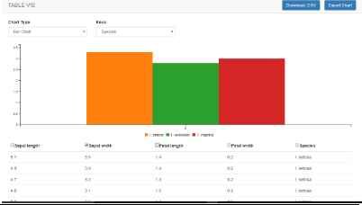
When the user selects a table, the Table-Viz webpage is spawned, as shown in Fig. 19. In this instance, a Scatterplot is chosen as the most suitable charting option, with color encodings used to identify between attributes.
Step 3: Filtering Blank Data Rows.
As the Tool-Viz webpage is spawned, and the data is passed, the data is filtered for blank data rows via the filtering function highlighted in section 3.6, and demonstrated in Fig. 4.
Step 4: Detection of Suitable Charts.
As the Tool-Viz webpage and corresponding chart is generated, the proposed tool checks for custom attribute types that describe the data types held within the HTML table, allowing for the tool to automatically determine the most suitable chart type. However, as these attribute types are not present in the currently available HTML tables found online, and in the interest of flexibility of the tool, a dropdown menu has been implemented to allow users to select a charting option of their own, shown in Fig. 20.
Step 5: Charting Options
As mentioned above in Step 4, to provide for flexibility and greater user choice, a dropdown menu is provided allowing for users to select their preferred option.
Although a poor charting option for the data, given the noise created in using a bar chart, Fig. 21 demonstrates the proposed tools ability to present one’s data in a chart of their choice.
In future, the proposed tool will alert the user to such an issue via prompts when the action is taken to change the chart type.
Additionally, more options are provided to the user. Focusing on Fig. 21, displayed in the top right corner are the download (.CSV) and chart exportation options. Additionally, beneath the visualization is a reproduction of the HTML table, allowing the user to easily compare and analyze the dataset.
Furthermore, the reproduced table in the Tool-Viz page and corresponding ‘Key’ dropdown menu provides a means for the user to filter the data they wish to include in their visualization.
Step 6: Data Selection
Displayed in Fig. 22, shows the data filtering and dynamic updating of the table in action. The user has selected species from the Key dropdown list and cross referenced it against Sepal width, chosen using the checkbox in the table. In doing so, they can effortlessly filter and examine the dataset in detail.
This demonstration displays the value and ease of the approach. Unlike currently available tools this approach allows users to directly access the dataset straight from the HTML table and visualize the data without the requirement for manual steps. This proposed tool is well suited to novices, removal of manual steps makes visualization fast, easy and accurate, eliminating the pitfalls that exists in current tools that lead to novices creating inaccurate visualizations.

Tool Icon.
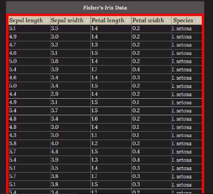
Table selection example. (Wikiwand, 2017)
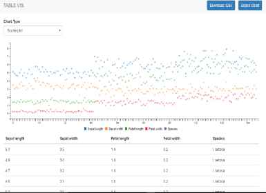
Scatterplot generated example.
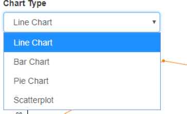
Chart Dropdown Menu.
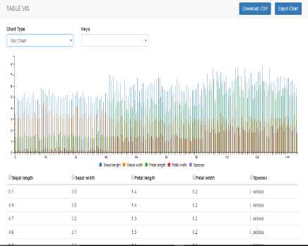
User Choice of Bar Chart.
filtering Data.
5. Testing & Evaluation
The focus of this section is to test and evaluate the success of the proposed approach. Both functional and non-functional tests were performed.
5.1. Functional Test
All functions implemented were tested and analysed. The testing results indicated a resounding success in functions in the proposed tool. Key functions including selecting tables, obtaining the dataset and generation of charts containing useful interactions all proved successful. The proposed tool also succeeded in filtering of blank rows and allowing for users to filter the chosen dataset values, reproducing the visualization dynamically as the dataset is cropped. Dynamic production of suitable chart functionality worked to great effect. However, this success was only partial because it relied on working upon custom created attributes in the HTML tables created for testing that are not present in generic HTML tables found online.
5.2. Non-Functional Test
Additionally, testing involving a user group of 42 university students, consisting of both visualization novices and intermediaries yielded positive feedback. The questions were designed to focus upon the most essential non-functional requirement required by the proposed tool;
Accessibility – Tool was easy to activate and make a selection with?
The results consisted of 71% strongly agreeing and the remaining 29% mostly agreeing. Vital as the inability of the novice to easily create visualizations would represent the failure of the approach.
Usability – Can you easily choose desired chart? (focus on manual chart selection, not dynamic selection.)
57% strongly agreed, with 43% choosing mostly agree. The answers to mostly agree corresponding to not seeing the dropdown menu right away, however, found it easy to use once acknowledged.
Effectiveness (A) – Are the interactions helpful?
There was a 71% split between strongly & mostly agree with the remaining 29% opting for neutral, stating additional interactions would be preferential.
Effectiveness (B) – Do the color encodings aid legibility?
Results showing an even split of 85% voting for strongly & mostly agree with the remaining answering that similar shades and color-blindness meant the help was minimal.
Emotional factors (A) – Tool Viz webpage is aesthetically pleasing.
43% opted for mostly agree, with 14 % opting for strongly agree. 14% remaining natural and the outstanding 29% voting strongly & mostly disagree. Commenting on a lack of animations.
Emotional factors (B) – Tool Viz is fun to use.
Results from the participants stayed exactly the same, indicating a possible correlation between the enjoyment of the webpage and the satisfaction with the tool.
Data Integrity – Do the charts accurately represent your data?
Findings showed that 57% opted for strongly agree and the remaining users choosing mostly agree. The validity of the charts produced is the fundamental requirement of such a tool, meaning the positive feedback here is vital.
5.3. Evaluation
Overall, the tool developed met the aim of the research. User testing proved the tool to be easy to use and understand, taking the data directly from the webpage, removing the requirement for manually transferring data or using additional tools to first scrape data and then upload it. Moreover, the visualization produced were accurate, filtering void attributes within tables and supported different visualization techniques. The only major drawback was the inability to dynamically select chart type based on the data gathered, although the solution of an HTML attribute detailing the data attribute type works, such an attribute is not present on current webpage tables.
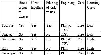
Table 1 compares current tools available in aspects significant to novice users. Including, whether the tool can visualize the data directly from a webpage, clarity, filtering of junk values, cost and learning curve. With the proposed tool displaying a clear advantage in direct access to webpage datasets, cost, filtering of junk data and a low learning curve.
TOOL COMPARISON
Although, more established platforms currently possess more charting options and additional functionality such as Datacopia’s chart animations. The purpose of this approach was not to create a visualization tool with advanced interactions and animations, instead the approach proposed successfully tackles areas where other options fail to address. Primarily, the proposed tool focuses on a means in which the visualization novice may be aided and encouraged to successfully create meaningful charts. Additionally, the currently available tools functioned via having a .CSV file loaded in for charting, they do not offer a means in which the user could directly accessing a dataset on a webpage. This results in the user having to find a method for scrapping the data from the source and then loading it into the chosen tool, again, a process unsuitable to novices. Furthermore, the use of tools such as the Google Chrome browser extension ‘Data Scaper’ [13] will transform a chosen dataset, however, the corresponding .CSV file produced will contain any junk values existing which will negatively impact upon the accuracy of the visualization produced. This proposed tool possesses filtering of Junk Values, without any knowledge of action required by the user, greatly aiding the suitability and encouragement for novices to create accurate visualizations.
6. Conclusion & Future Work
The approach proposed presents a novel viable solution to visualising HTML table datasets easily and accurately. The testing and evaluation results show that the proposed approach is successfully designed and implemented. It also proves that browser extensions can be used to obtaining and transforming online data into visualizations.
The tool implemented successfully allows for the generation of HTML table dataset visualizations, with the option of four different chart types. The visualizations come with features such as clear and precise axis, color encoding, user interactions and a selection of exportation methods. Testing results found the tool to be able to maintain data integrity with the clear majority of the feedback proving extremely positive, providing much to be optimistic about in the future.
Although, a very promising start, there remains elements that could be performed to improve the tool. Such areas include, implementing additional charting options and increasing functionality such as, note taking and animations, providing tutorials and popup prompts to users aiding education. However, most importantly, find and implement a method for dynamically detecting data attribute type and chart selection. A proposed further research direction will be via the semantic web and the creation of an appropriate ontology. From which point the tool could be published to the Chrome Store.
References
Cite this article
TY  - JOUR
AU  - Christopher Johnston Downie
AU  - Taoxin Peng
PY  - 2018
DA  - 2018/01/02
TI  - Visualization of Online Datasets
JO  - International Journal of Networked and Distributed Computing
SP  - 11
EP  - 23
VL  - 6
IS  - 1
SN  - 2211-7946
UR  - https://doi.org/10.2991/ijndc.2018.6.1.2
DO  - 10.2991/ijndc.2018.6.1.2
ID  - Downie2018
ER  -