
Health advocacy with Gapminder animated statistics
- DOI
- 10.1016/j.jegh.2011.07.001How to use a DOI?
- Keywords
- Epidemics; HIV; Tuberculosis; Swine flu; Gapminder
- Copyright
- © 2011 Ministry of Health, Saudi Arabia. Published by Elsevier Ltd.
- Open Access
- This is an open access article under the CC BY-NC-ND license (http://creativecommons.org/licenses/by-nc-nd/4.0/)
1. Introduction
How can the public’s understanding of public health trends be improved? How can health researchers increase their impact on public opinion and policy-making? More media coverage, such as press reports and TV interviews, are needed; however, the internet nowadays provides alternative options for educating and communicating. Gapminder Foundation, which grew out of the Global Health Division of the Karolinska Institute, Sweden, took advantage of the new information technology (IT) opportunities and created a non-profit web service (http://www.gapminder.org), which presents a fact (data) – based view of global development trends. With the freely accessible data from many international organizations (e.g., World Bank, World Health Organization [WHO], and the United Nations Educational, Scientific and Cultural Organization [UNESCO]), the abstruse numbers were converted into enjoyable, animated and interactive graphics, and the Gapminder website was dedicated to making the time series statistics of global development in economics, health, environment, education, demography and energy easily understood and freely accessible to users.
In this article, the use of the interactive tool “Gapminder World” will be demonstrated along with a brief description of the successful experience in conveying public health information with Gapminder animated statistics.
2. Gapminder World
The most popular tool on the website is “Gapminder World,” which enables interactive animations of more than 400 socio-economic indicators. The yearly improvement or deterioration revealed by the statistics or the correlation of indicators over decades or even centuries can be simultaneously displayed for all the countries in the world. The innovation is that each country is displayed as a bubble that moves across the screen, just like a soccer player moves across the football field. Hence, the dimension of time is no longer a static representation on the x-axis, but rather a graphic display of statistics in motion.
Fig. 1 shows the graphic interface of “Gapminder World”. Each bubble represents a country, of which the names can be shown or selected by clicking on the bubbles. In the default setting, the color displays the continents (the color settings can be changed in the upper right corner). This graph displays the latest data on the global HIV epidemic. The bubble size represents the number of people living with HIV/AIDS, which can also be changed into other indicators in the lower right corner. The vertical axis shows the prevalence rate of “Adults with HIV (%, age 15–49),” and the horizontal axis shows the “Income per person,” i.e., Gross Domestic Product (GDP) per capita, which is expressed in inflation-adjusted international dollars (differences in purchasing power have been adjusted to enable comparisons across countries and over time). By moving the mouse cursor to the name box on the horizontal and vertical axis, a box explaining the meaning of the indicator axis will emerge. The year is displayed in large fonts in the background. By dragging the time-slider at the bottom you can scroll to select the year you want to see. By clicking the “Play” button in the lower left corner, 30 years of the tragic HIV epidemic will be displayed in animation. To access the data sources or view the data in spreadsheet format, you can click on the small font text or the small squared icon beside the indicator names. In addition, by selecting the countries of interest, the tracks of bubbles as they move over the years can be highlighted, and the gap between each of them can be easily viewed.
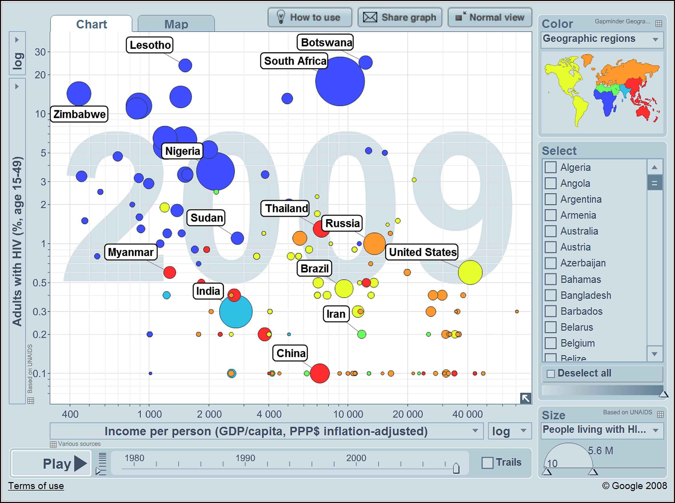
The global HIV epidemic as shown in “Gapminder World”.
By selecting four countries (Fig. 1: Tanzania, India, South Africa and the United States) and then clicking on the box of “Trails,” which can be found on the right side of the time-slider; and then dragging the time-slider from 1990 till 2009, you will see Fig. 2. During the last two decades, an increasing number of people were infected by HIV, but the increasing trend was reversed in some countries, in particular Tanzania and India, while the trend was stagnant in the other two countries (South Africa and the United States). The graph helps the user to appreciate the fact that HIV occurrence is not simply associated with low income.
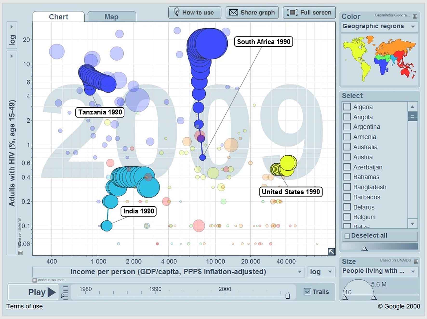
The HIV epidemics of Tanzania, India, South Africa and the United States as shown in “Gapminder World”.
The interactive graphs shown as Figs. 1 and 2 can be accessed from the link: http://www.bit.ly/eZA5z1 and http://bit.ly/j0lTTn respectively.
The user can also change the indicators displayed in the graphs easily by selecting alternative indicators if the data are available from the pull-down menu of the indicator field. For instance, by changing the vertical indicator in Fig. 2 into “Infectious TB, new cases per 100,000 – estimated,” the user will see the graph shown in Fig. 3 after clicking the “Play” button in the lower left corner. The moving trails of bubbles clearly reveal the trends of tuberculosis prevalence and HIV occurrence within different countries. Unlike in Fig. 2, while the countries were getting richer during the last two decades (the bubbles move rightwards), the burden of tuberculosis in India and the United States remained relatively steady (the bubbles barely move on the Y axis) although the occurrence of HIV still increased (the sizes of the bubbles get larger). But, meanwhile, the burden of tuberculosis increased remarkably in South Africa (the bubble moves upwards), and climbed up and then declined in Tanzania (the bubble moves upwards and then downwards) while the occurrence of HIV slightly increased (the bubble size only gets larger). This graph demonstrates that low-income countries could gain some advantages in their efforts to control the HIV epidemic by actively addressing the ‘double-trouble’ of HIV-related tuberculosis, e.g., Tanzania. Similar strategies should be used in middle-income countries like South Africa, where tuberculosis increased together with the number of people living with HIV/AIDS. This graph can also be accessed from this link: http://bit.ly/mlvxk8.
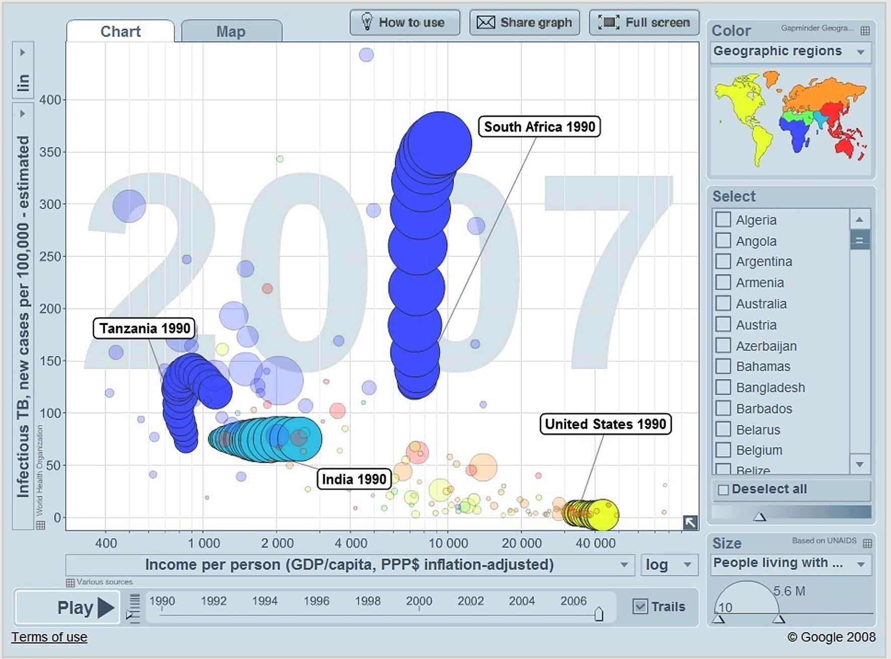
The HIV and TB epidemic 1990–2007 of Tanzania, India, South Africa and the United States as shown in “Gapminder World”.
To improve the accessibility and utility of health statistics in public health, hundreds of interesting social-economic and cultural indicators have been included in “Gapminder World” covering epidemiology, public health and health economics. Therefore, it does not matter whether the user is trained as an epidemiologist or is a politician or just an absolute stranger to statistics, relevant data can be explored in “Gapminder World” and in turn can be shared with others to impart the importance of time-series data that are of interest to the field being researched, e.g. cancer, nutrition, injuries and maternal mortality.
The web version (http://www.gapminder.org/world) takes just moments to load, and there is also a free, off-line desktop version that can be downloaded and installed on any computer (http://www.gapminder.org/desktop).
3. Illustrations of Gapminder applications
“Gapminder World” can be a useful tool in educating medical students. However, interactive visualization tools are not sufficient to make numbers and academic knowledge attractive to the general public. Therefore, many ways to make statistics understandable have been explored. As a result, “public health videos” have been produced and are available for free use on “Youtube”.
One successful example is the “Swine Flu video” (Swine flu alert! News/Death ratio: 8176, http://www.youtube.com/watch?v=V8bUtbODV-Q). To produce a warning concerning media exaggeration with regard to “Swine Flu,” a video was made within a few hours in the office using screen recording software. It includes the Gapminder animated statistics and the audiovisual records of the speaker. Although produced at low cost, this video has been viewed by 100,000 internet users, and it also had some positive impact on media as well as policy makers during the 2009 epidemic by making them reconsider or even halt unnecessary nation-wide vaccinations against H1N1 influenza. There are other successful cases, including “Hans Rosling on HIV: New facts and stunning data visuals” (http://www.ted.com/talks/lang/eng/hans_rosling_the_truth_about_hiv.html) and “Hans Rosling’s 200 Countries, 200 Years, 4 Minutes – The Joy of Stats – BBC Four” (http://www.youtube.com/watch?v=jbkSRLYSojo).
In conclusion, “Gapminder World” is available for exploration, and it can be used together with other tools to make short videos, or to invent even better ways of explaining health statistics.
Conflict of interest
There is no conflict of interest for this paper.
Cite this article
TY  - JOUR
AU  - Hans Rosling
AU  - Zhongxing Zhang
PY  - 2011
DA  - 2011/12/01
TI  - Health advocacy with Gapminder animated statistics
JO  - Journal of Epidemiology and Global Health
SP  - 11
EP  - 14
VL  - 1
IS  - 1
SN  - 2210-6014
UR  - https://doi.org/10.1016/j.jegh.2011.07.001
DO  - 10.1016/j.jegh.2011.07.001
ID  - Rosling2011
ER  -